Categories
(#Alt-)Academia

Data visualizations: Learning d3.js

[Cross-posted at scholarslab.org]

The SCI study on humanities graduate programs and career preparation is humming along, and while survey responses come in, I’ve been working on determining how best to translate the data into meaningful graphics. After a lot of experimenting, I think the winner is d3.js. Short for for Data-Driven Documents, D3 is Michael Bostock’s creation; a quick glance at his gallery shows the kinds of beautiful and complex visualizations it’s capable of. It’s a low-level tool, though, which means that learning to use it even in a rudimentary way has already involved picking up some html, css, and javascript along the way. It’s a lot to chew on, but I think I’m starting to turn a corner as a blurry whirl of concepts, terms, and commands are slowly resolving themselves into some clarity.

While I don’t have anything that cool that to show yet, I’m excited that I do have a little something. Here’s the fruit of everything I’ve learned so far:

Categories
Writing

Playing with visual text analysis using Voyant

As I’ve started to dip my toes into the DH current, one thing I’ve been excited to play with is visual presentations of text analysis. Until I hadn’t had a strong need for it, but with the approaching SCI survey of alt-academics and the analysis it will entail, I finally have a good reason to start exploring what’s out there.

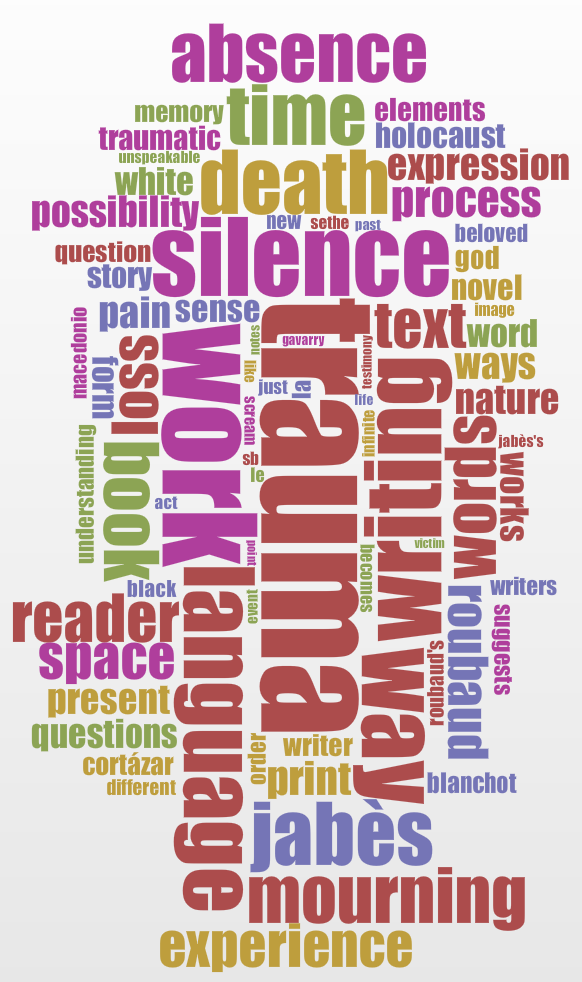
The first tool I’ve checked out is Voyant (developed by Stéfan Sinclair and Geoffrey Rockwell as part of their hermeneuti.ca project), which allows you to upload a document, point to a URL, or copy text; it can analyze a single document or a corpus. I uploaded my dissertation as a sample and, after stripping out articles and such (which the tool makes very easy), I got a nifty word cloud:

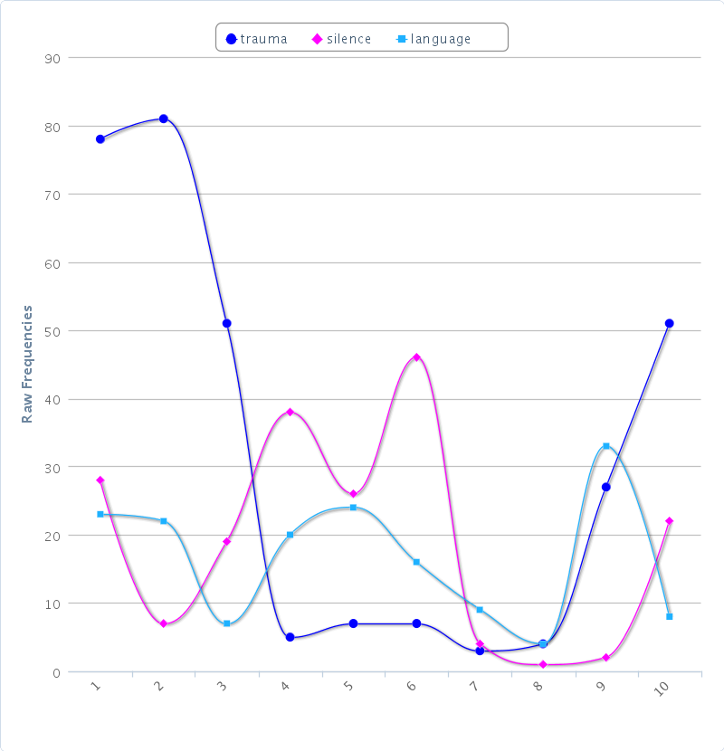
Below it, Voyant displays a list of words by frequency. Checking boxes next to one or more words gives a distribution of word appearance in the document or corpus. Here are three commonly appearing words charted through the diss:

I found it interesting to see that while I clearly used the word “trauma” a ton, the places where it appeared the most were in the intro and conclusion–suggesting that I relied on the term when I was pulling my argument together, but much less in the actual analysis. A section below the chart shows the context of the selected words in a table that can be sorted in a variety of ways. All the data in each section can be exported in a number of formats, too, for use in other sites or documents. (More than ever, I’m feeling pinched by having my blog hosted by wordpress.com, which doesn’t support things like iFrames; I hope to get a more flexible set-up going before too long.)

There’s a lot more that Voyant can do, and I’m looking forward to playing with it (and other tools) a lot more as I get a clearer sense of what kind of analysis I want to do. More soon!